Peter Kuper Finds a New Artistic Home in "Ruins"

A two-year stint in Mexico changed the way the New York City comic artist thought about his work.
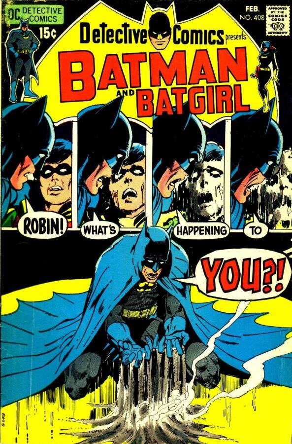
[Updated] It’s tempting to neatly divide comic artist Peter Kuper’s work. Ruins looks like his love gig—a graphic novel that tells the story of a couple that visits Oaxaca during a teachers’ strike that turns violent—while Mad’s Spy vs. Spy is the money gig Kuper has been doing for 19 years now. He doesn’t own Spy vs. Spy, which was created by the Cuban artist Antonio Prohias, so he doesn’t have the sort of core investment in it that he does in a project like Ruins, that is his from conception to completion.
That schematic sells Spy vs. Spy short, though. Kuper will be in New Orleans for the Wizard World Comic Con, where he’ll be on a panel about drawing funny Friday at 5, and one on working in mainstream and independent markets Saturday at 11 a.m. He enjoys each project for different reasons.
Kuper is part of the second generation of underground comics artists—people whose roots were in the art galleries rather than head shops, and the wars they fought weren’t between the straight and freak cultures but across the high and low art divide. Comic strips, Mad, and Will Eisner informed their ideas about what comics could be, and their flagship magazines were RAW and World War 3 Illustrated, which Kuper edits There was no single unifying element between the artists beyond a conviction that comics could do a lot more than tell power fantasy stories featuring dudes in colorful underwear.
Kuper’s work has been in the public eye since 1979, and they have always been political at some level. He had done autobiographical comics, and adapted Kafka’s The Metamorphosis. Still, he recognizes that he became known for his political art—something he started to weary of by the end of George W. Bush’s presidency. “Bush fueled a lot of very iconic political illustrations that I was doing,” he says. “I got kind of burned out doing that because I’d been foaming at the mouth for decades with Reagan and Bush and Clinton too. Then especially those eight years of George W. Bush, I was really on the artistic warpath with the kind of work I was doing. When I open a drawer filled with art I did during the Bush administration, it’s all screaming, and I got tired of that tone. I wanted to see what other ways to communicate that wasn’t a fist in the face.”
Much of his work was done using spray paint and stencils, and they contributed to the raw, confrontational tone he wanted to get away from. Changing political interests forced him to rethink his tools as well, since it’s hard to talk about climate change in aerosol-charged spray paint.
Kuper’s artistic life was changed by a trip he, his wife and daughter lived in Oaxaca from 2006 to 2008. Leaving his New York City home and being there during a period of political violence put American politics into perspective. Seeing tanks in the street and federal troops deployed by the government to put down a strike, he realized that he wasn’t tired of politics—just the banal, repetitive nature of American politics.
The abuse of power is an essential component of Ruins, but it is not the whole of the story. The central story is that of a couple trying to work through a troubled relationship, and even though it is broken into chapters, the book was never serialized. Kuper always intended for it to be read as a novel. When he first roughed out Ruins, it was approximately 250 pages long and ended around 328. “If I had another year, I would have gone on another 100 pages,” he says. “I might have put more air in it. Having the additional space was what was needed, and because it was a personal project, it was something I felt compelled to do.”
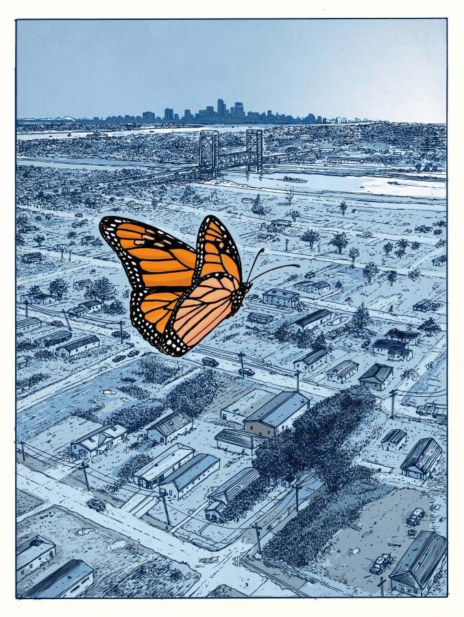
The book grew in length as he put pages between chapters to let each chapter have a feeling of finality, and he expanded the interstitial chapters that depict a Monarch butterfly’s migration from Canada to Oaxaca. As initially rendered, “they went by far too quickly,” Kuper says. In their final form, each Monarch chapter wordlessly presents what the butterfly sees en route to Mexico, whether its migrant workers in the fields or the Lower Ninth Ward after Hurricane Katrina. One chapter goes into the butterfly’s head to represent its internal consciousness instead of the terrain it covered.
That chapter came when Kuper realized, “I didn’t have the point of the Monarch, internally,” he says. “I’m telling all these other people’s stories, so I have a chapter that is meant to be in the mind of the Monarch.” He made that realization in the final months of working on Ruins, when it was his day-in, day-out project as he worked to meet his self-imposed deadline. When in that mode, the project stayed in his mind, even when he was away from his studio. “I might solve problems just about in my sleep,” he says. “I would wake up in the morning and go, Oh right! I’ll do that, or I missed putting that chapter in, or I need to expand that. When you’re living with a project, you’re thinking about the characters and what they’re doing and maybe jumping from character to character.”
For Ruins, Kuper worked more conventionally, using pen, ink and watercolor. The shift began while in Oaxaca, where he filled sketchbooks with life drawing and sketching. He liked the direct contact with the page that he got with the pen and brush, which was more tactile and human experience than spray paint and stencils. “They have a lot of stages, and you don’t get the kind of immediacy that you get from looking at something and putting a line down,” he says.
Still, he sees common threads between Ruins and his more graphic work. The Monarch butterfly chapters are told entirely through images, much like his spray-painted art. Words would likely have only intruded in those chapters, but their omission had more prosaic benefits as well. “It freed me from the complications of figuring out where word balloons go and what people would say,” Kuper explains. “It made it much more visually driven.”

Spy vs. Spy is entirely visual, and for Kuper it’s an exercise in form where as Ruins was driven by its story and themes. If you want to be generous, you can see it as being about the futility of war, but really, “it’s ‘Itchy and Scratchy’ or Wile E. Coyote.” Anybody who has ever seen even one Spy vs. Spy gag knows that the two spies will try to kill each other and one will succeed in the most improbable way. Kuper likens it to a mystery or magic trick, where misdirection and red herrings keep the reader from seeing the resolution coming, and much of the humor comes from the extreme unpredictability or hilariously labored journey from start to cannon blast in the face.
If readers take anything political away from Spy vs. Spy, that’s a win for Kuper. “Working for Mad, part of my job is to bend young minds where I can,” he says. That usually takes place through the actual composition of the page. He frequently looks back to turn of the 20th Century comics and artists such as Winsor McCay for inspiration as to how the panels could be laid out. “One I’m working on now, the whole magazine has to be turned sideways.” Prohias’ Spy vs. Spy worked almost exclusively with rectangular panels, while Kuper regularly shapes them to suit the gag’s needs and manic energy.
Kuper worked to use panels and page layouts in innovative ways in Ruins as well, but his decisions are more subtle. On one occasion, four panels depict the main character taking photos of insects. The fifth that we read is a two-page spread over which the first four panels lay, and it shows the town center covered with protest posters—something that would have been obvious to anyone who didn’t have his head down and his field of vision restricted by a viewfinder. The moment isn’t showy, and that’s the way Kuper intended. “I tried to keep the fancy footwork in the background,” he says. “It’s like if you see movie and there’s a hand-held camera. You’re not thinking about the hand-held camera or the director being involved, but you’re getting the documentary style or the quality that someone’s walking behind you in a horror movie. A low angle or a high angle will engage you more or remove you. For the reader, that’s very subconscious. My job is to have those things in there that most serves the story, and for your second or third read—which any cartoonist hopes for considering I spent three years on a book that you can read in 45 minutes—and enjoy the backgrounds or the page layouts, or things they hadn’t seen before.”

Updated January 14, 10:16
Kuper has been doing "Spy vs. Spy" for 19 years, not 16 as first reported.


